Welcome
A brand identity is a vital element in communicating a company’s market differentiation and brand values. It is definitely the most visible element, and as such, should be treated with care and consistency.
This identity manual sets out fundamental rules and guides to help create and maintain a strong, recognizable and meaningful brand. Used properly, it will allow the brand to continually reinforce the company’s vision, mission and core values while attracting the target audience.
You want your brand to live in the hearts and minds of prospects and customers. Use this manual judiciously, and you’ll be well on your way to making that happen.
Brand Platform
The Wine Lovers Plus Platform defines the essence of the organization and is meant to guide all activities and communications.
Vision
To be the most welcoming and rewarding stop for wine, spirits, and specialty finds for both locals and travelers—where discovery, quality, and value meet community and fun.
Mission
To make great wine, spirits, and other products accessible and enjoyable for everyone — through expert guidance, unbeatable deals, and a friendly, approachable experience.
Core Values
Core values are the fundamental beliefs of a person or organization. These guiding principles dictate behavior and can help people understand the difference between right and wrong. Core values also help companies to determine if they are on the right path and fulfilling their goals by creating an unwavering guide.
Expertise Made Simple: Knowledgeable advice without intimidation.
Friendly & Approachable: Treat everyone like a friend.
Great Value: Unbeatable pricing without compromising quality.
Discovery & Fun: Encourage exploration and learning.
Community & Connection: Be part of the neighborhood and regional traveler culture.
Brand Identity
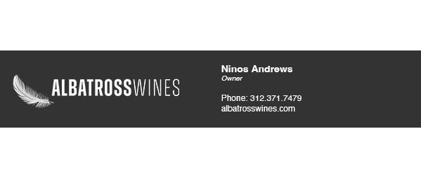
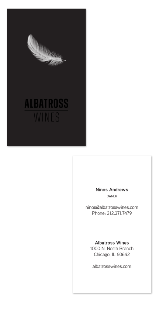
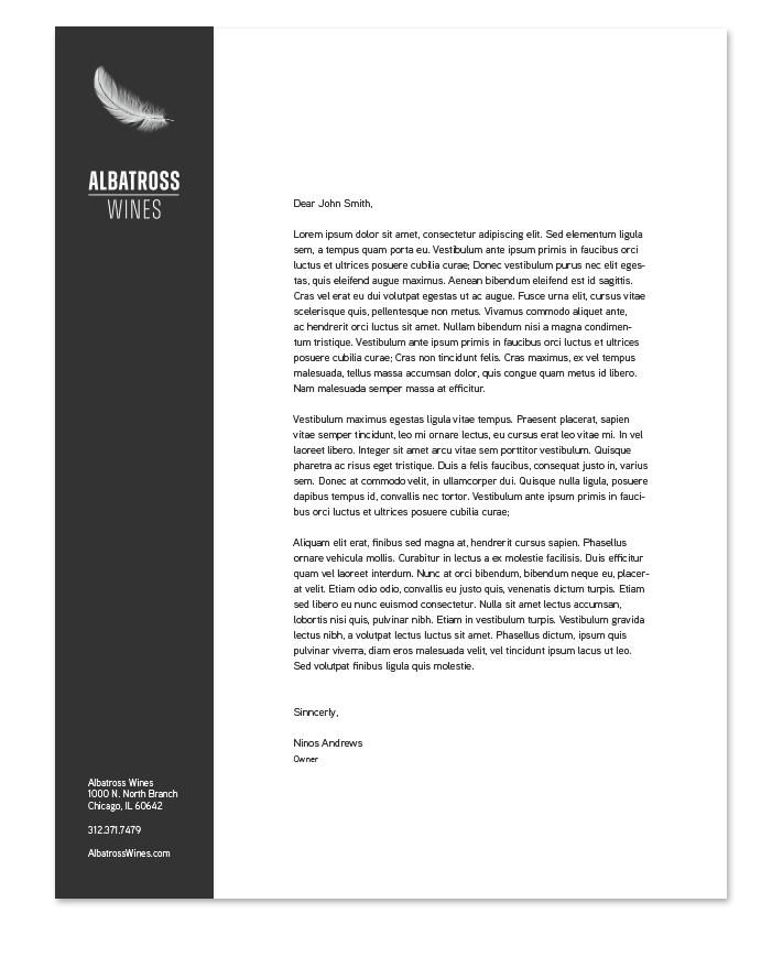
Logo
The logo is the visual representation of an organization and is the most important carrier of the identity. Therefore, it is critical to use the logo consistently and with consideration for the image it projects. The logo should be used to unify and
strengthen all internal and external communications.
The logo is distinct and its forms have been carefully considered. This is why they may not be altered in any way. Using the logo incorrectly undermines the brand and causes inconsistencies with your image. It is therefore very important that this manual be followed carefully.
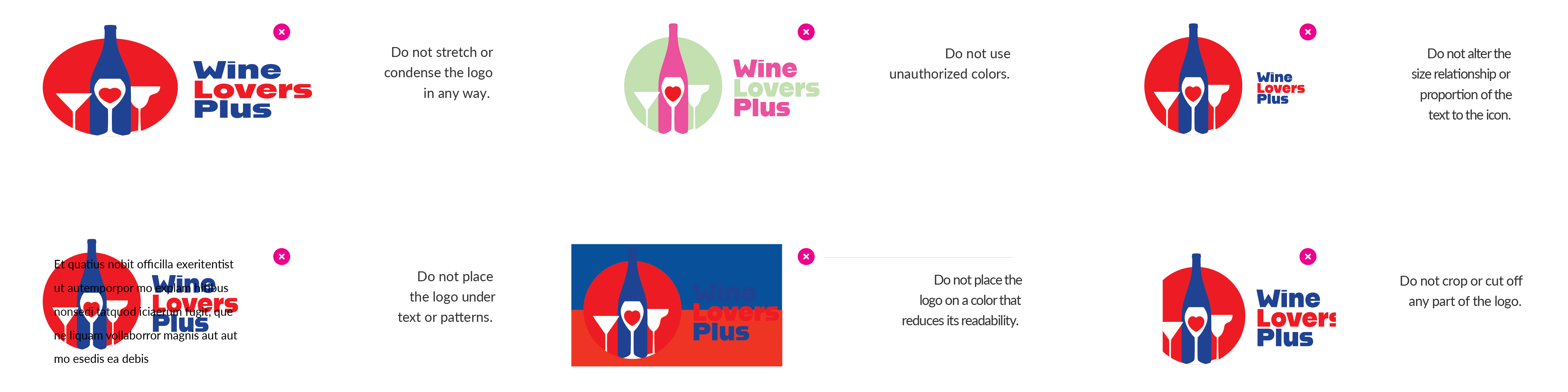
Unacceptable Usage
The logo should never be used in the following ways:
Support Element
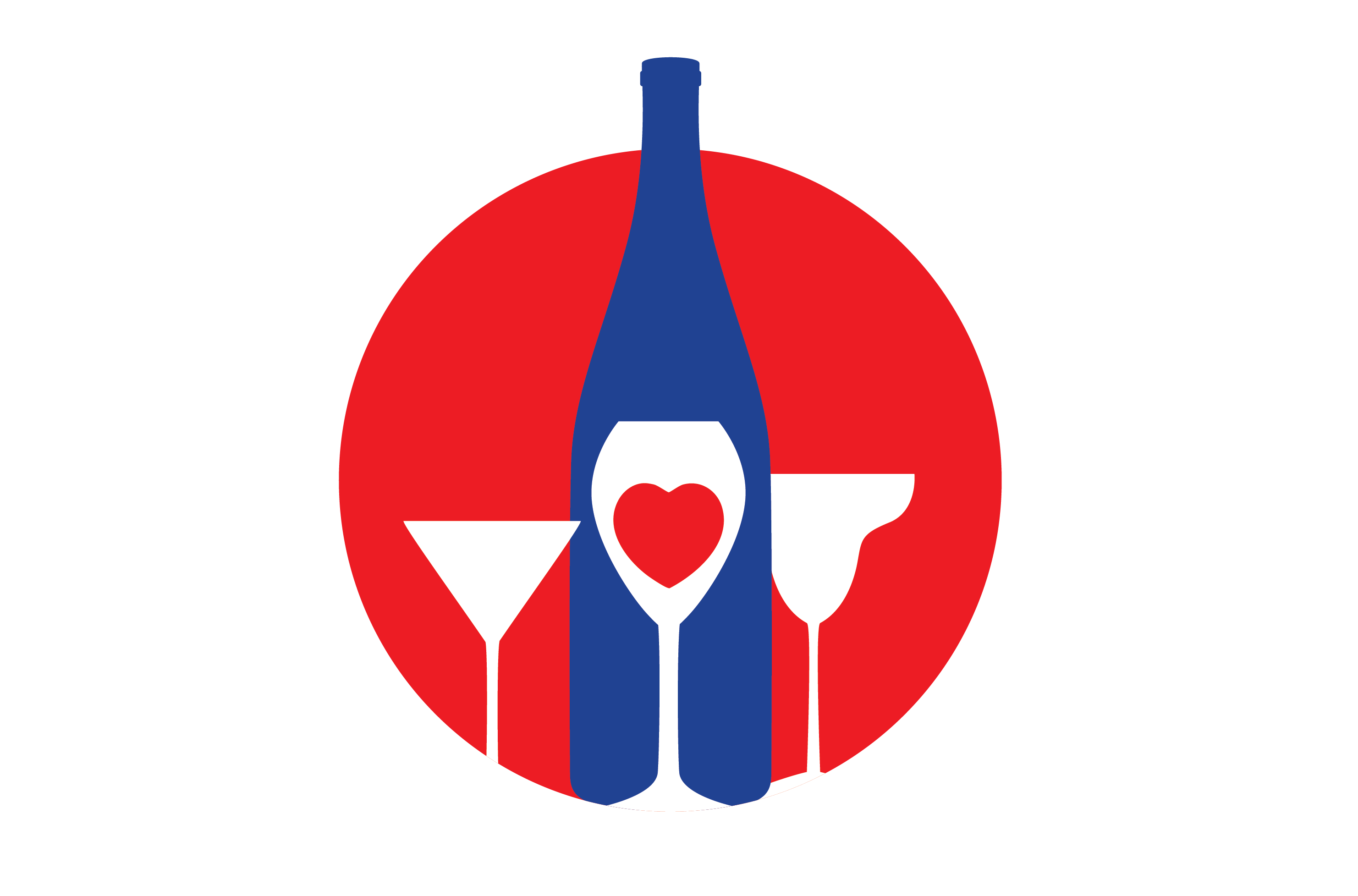
The Wine Lovers Plus‘s icon mark can be used separately from the logo on certain occasions as a design element.
Clear Space Requirements
Clear space gives the eye a place to rest and also helps direct the eye to what we want to be seen.
A minimum amount of clear space must be maintained around the logo at all times to ensure its visibility and protect its integrity. The clear space differentiates the logo from all other elements on a page including all text, graphics, photographs and the edge of a page, which must be kept outside the clear space.
A simple rule for determining the appropriate amount of clear space is the Height of the W. The Height of W Rule is based on 2 times the height of the W letter in the logo. Simply measure the height of the W and double it to determine the minimum amount of clear space that should surround the logo.
The Height of W Rule is applicable for a logo of any size.
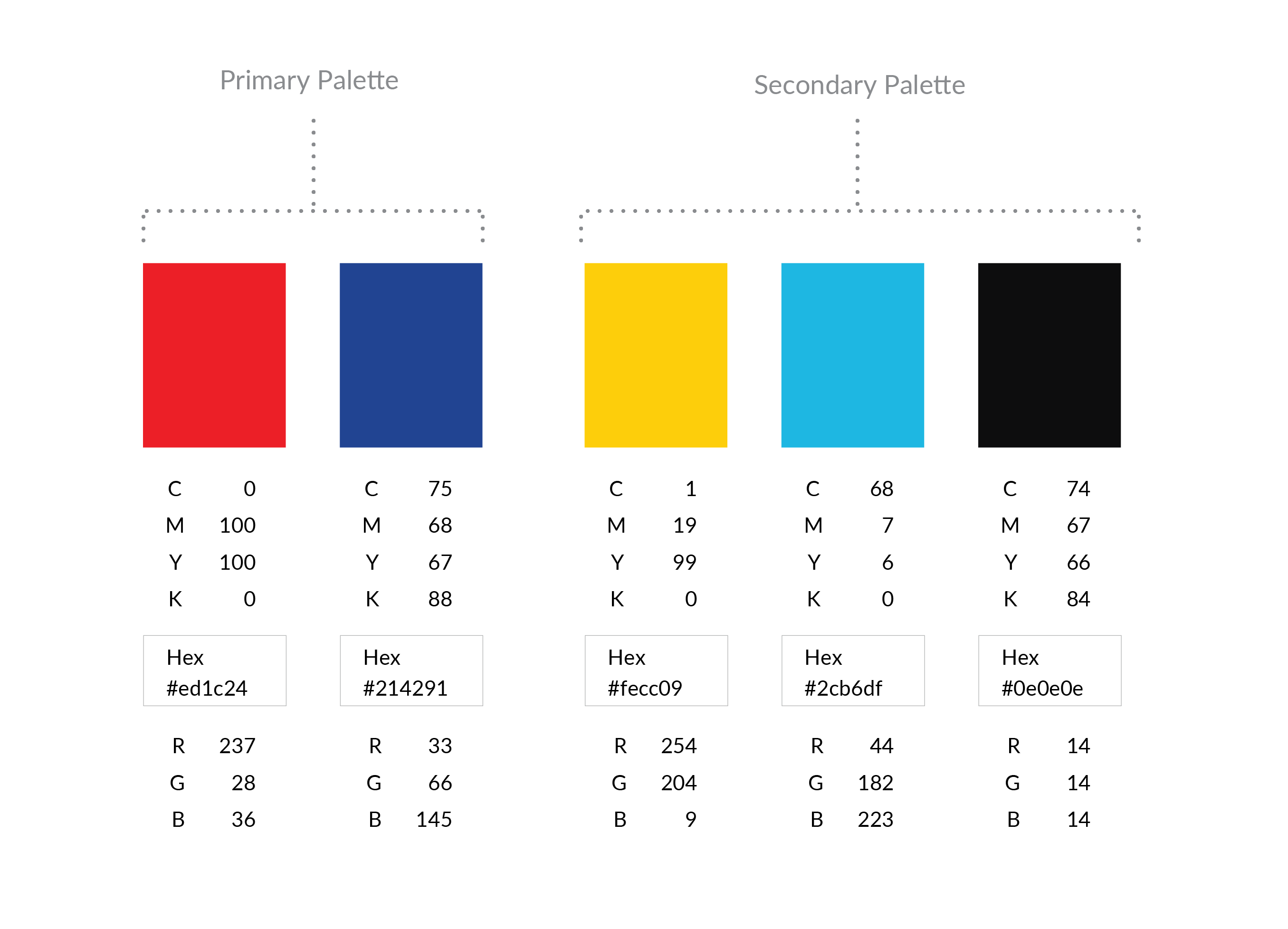
Color Palette
The palette represents the spectrum of acceptable brand identity colors and should be used for all types of media. The primary palette represents the colors that should be used the most and the secondary palette represents the colors that should be used as accents. No other colors should ever be used.
Typography
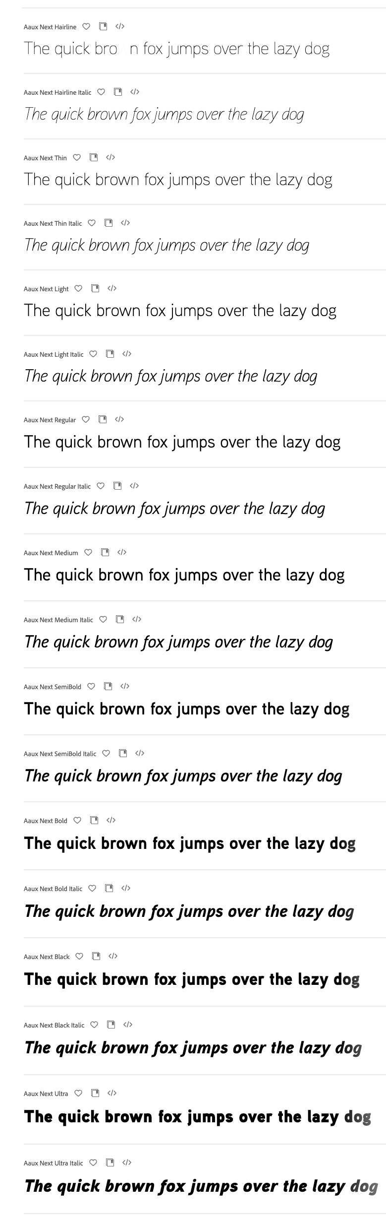
The typeface selected for Wine Lovers Plus helps create a consistent and recognizable brand presence in all communications. Aaux Next should be used on all internal and external applications including all printed communications, digital presentations, signage, promotions and merchandise.
For website and email applications in which Aaux Next is not available, it may be substituted with Helvetica or Arial.
In most cases, the variations in the Aaux Next family of typefaces offers a lot of flexibility. However, using more than two or three variations in one document is not recommended. For the best results, follow these simple rules:
- For running text use Aaux Next Regular.
- For bold text use Aaux Next Bold or Black.
- For captions use Aaux Next Italic or Light Italic.
Files
A variety of file formats for the material covered here are provided. This is a quick list of what each file format means, and where they would best be used.
Brand Identity Graphics
.ai format is the “raw” format and will likely never be used internally.
.eps format is a standard logo format and is ideal for printers and other professional uses.
.jpg format is lower quality but will work well for internal use with Microsoft office software.
.png format is similar to .jpg except it has a transparent background and not all applications recognize it. This format is ideal when placing the logo on top of color.
Brand Asset Graphics
.idml and .indd formats are the “raw” format and will most likely be used by a printer or designer.
.pdf format is used to present documents in a manner independent of application software, hardware and operating systems. It is not editable.